The structure crisis in technical AI art
Most generative AI models struggle with structural layouts. If you ask a standard model to draw a system architecture diagram, the result usually consists of misplaced arrows, misspelled labels, overlapping boxes, and a chaotic mix of unrelated visual styles. The model tries to generate a beautiful illustration rather than organizing logical components.
This breakdown occurs because standard prompts do not establish structural boundaries. When a rendering engine lacks explicit spatial limits, it places elements randomly across the canvas.
To solve this, we must write prompts using a zone-based modular layout. By defining precise functional areas, specifying geometric nodes, and limiting the color palette to high-contrast technical accents, we can direct the model to produce clean, professional system diagrams.
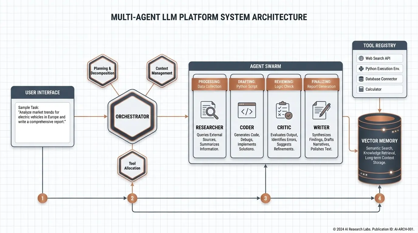
To show how these principles work, we generated the featured system diagram below using our structured, zone-based master prompt:
The resulting illustration has clean spacing, distinct functional groupings, and precise alignment, proving that structured prompts yield predictable technical outputs.
The master prompt card
Here is the production-ready master prompt, optimized to render a highly structured system diagram with distinct operational zones:
Share this prompt
Diagram mechanics: how the parameters interact
Designing a reliable diagram prompt requires treating the text as an interface configuration. Every parameter has a functional role in directing the layout:
Prompt phraseMechanical functionUnder-the-hood rendering impact"divided into four distinct, aligned zones"Spatial partitioningPrevents the model from clustering all elements in the center of the canvas. Forces a structured, multi-column or grid layout."central hexagonal hub... satellite modules"Focal geometric shapesEstablishes a clear operational hierarchy. Hexagons naturally draw focus as decision-making nodes, while circles serve as status indicators."light gray grid pattern"Alignment guideSeeds the background with coordinate hints. The rendering engine uses these grid lines to align the borders of cards and text elements."restrained palette of deep slate, cool white, copper"Color boundaryEliminates random rainbow fills. Restricting the colors ensures a cohesive, professional aesthetic that mimics modern enterprise tools."thin arrows, and numbered sequence circles"Relational pathsGuides the model's line-generation engine. Directs it to connect the shapes logically rather than drawing chaotic intersecting lines."generous whitespace, crisp modern typography"Legibility controlPrevents the model from filling empty spaces with garbled text or meaningless icons, maintaining clean margins.Five creative variations
You can adapt this structural framework to represent other complex processes. These five original, fully written prompts use distinct coordinate designs and processes to avoid repetitive templating patterns.
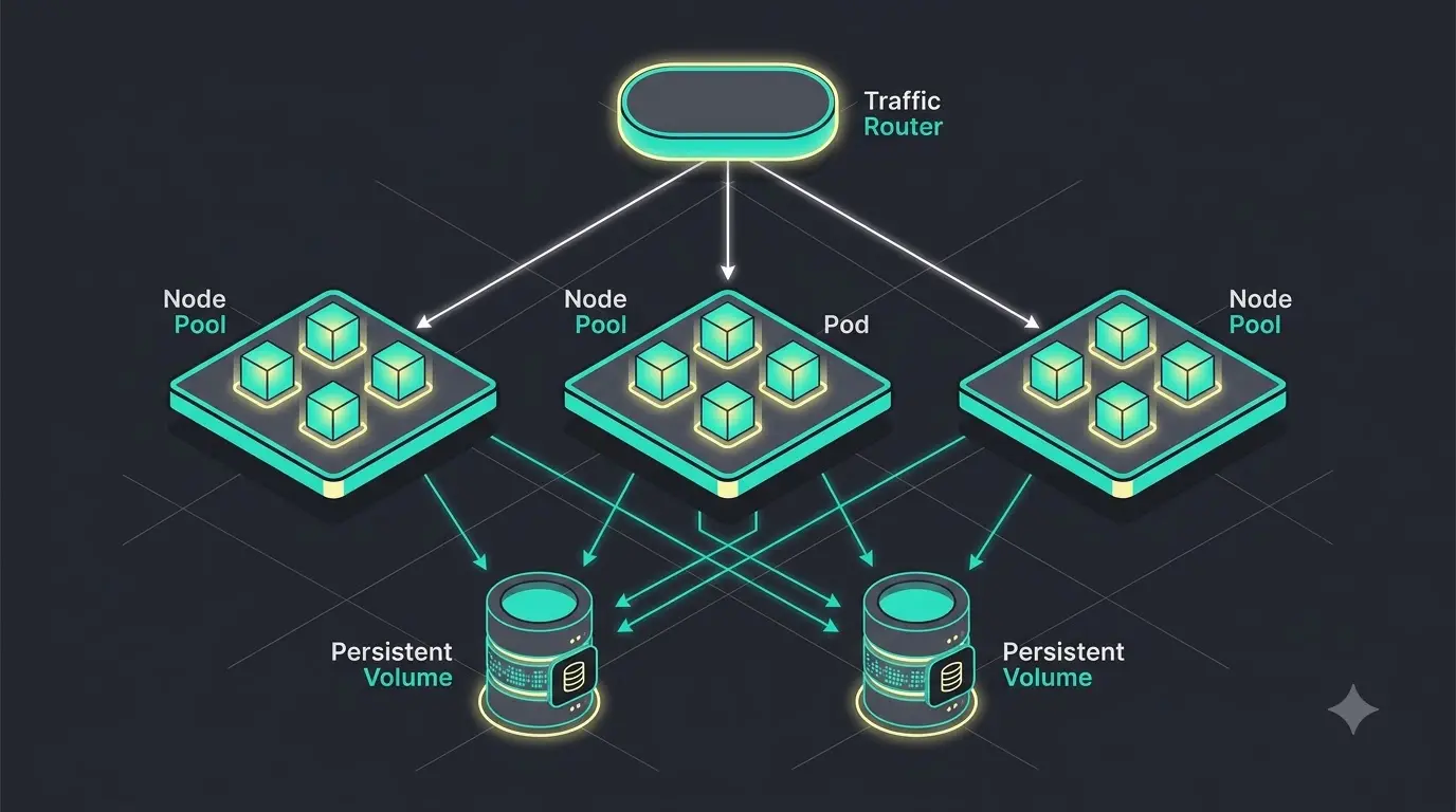
1. Kubernetes container orchestration map
Depicts container lifecycle events, pod clustering, and ingress routing using a clean, dark-mode isometric grid.
2. Retrieval-augmented generation data pipeline
Traces document parsing, vector indexing, similarity search, and model synthesis in a linear, left-to-right flow.
3. Holographic game engine render loop
Details the rendering cycle from input processing to frame buffer execution using a classic neon-cyber style.
4. Decentralized finance smart contract lifecycle
Tracks transaction verification, liquidity pools, and ledger finality in a highly structured, circular flow.
5. Autonomous robotics sensor fusion hierarchy
Illustrates sensor sweeps, local path planning, and physical actuation in a stacked, three-tier architecture.
Platform calibration index
Different rendering engines process technical parameters and alignment cues in distinct ways. Use this calibration table to optimize your diagrams:
EngineIdeal syntax & flagsStrongest attributesCommon bottlenecks & fixesMidjourney (v6 / v7)Set aspect ratio with --ar 16:9. Use --style raw to disable default illustrative painting algorithms.Unmatched surface material depth, realistic soft shadows, and clean vector line rendering.Text characters can drift into random gibberish. Place required labels inside strict double quotes to improve readability.DALL·E 3Write highly detailed, structured text. Describe the relative layout positions explicitly (e.g., "on the left side", "at the bottom").Flawless text rendering and exceptional compliance with complex layout instructions.Sometimes introduces busy, glossy gradients. Force a flat, minimalist vector style by requesting "flat 2D vector graphic".Gemini (Imagen 3)Set quality to high or ultra. Use precise geometric descriptions and limit the color palette inside the prompt.Incredible color saturation, clean edges, and professional-grade layout rendering.Can occasionally render lines with soft, blurry edges. Add "crisp vector lines and sharp borders" to maintain high contrast.Stable Diffusion (SDXL / v3)Use weight modifiers like (slate gray lines:1.2). Pair with a precise negative prompt: (3D render, cartoon, blurry:1.3).Complete local customization of layout dimensions, seeds, and custom-trained model weights.Requires careful negative prompt building to avoid warped lines and misaligned boxes.Troubleshooting: solving common diagramming failures
If your technical diagrams look cluttered or disorganized, check your prompt against these three common structure errors:
- Error 1: The "Spaghetti Connection" (Uncontrolled line clutter)
- Why it happens: Simply asking for "arrows connecting elements" without defining their behavior. The model will draw messy intersecting lines across the entire frame.
- The Fix: Use the grid-based zone approach. Group your elements into labeled zones (e.g., "Zone 1", "Zone 2") and instruct the arrows to connect the zones sequentially (e.g., "thin arrows connect Zone 1 to Zone 2").
- Error 2: Font and character mutation
- Why it happens: The model tries to generate labels dynamically based on neighboring shapes, leading to warped letters.
- The Fix: Put required labels in straight double quotes (e.g.,
labeled "User Interface"). Keep labels short, single-word where possible, and specify a modern, clean font style (e.g., "crisp modern typography"). - Error 3: 3D glossy "Web 2.0" overkill
- Why it happens: Using terms like "futuristic", "complex", or "3D rendering". This prompts the model to fetch detailed sci-fi game assets, which look unprofessional in an academic or business setting.
- The Fix: Enforce a flat, print-ready medium. Use specific descriptive phrases like "clean technical illustration", "flat 2D vector graphic", and "white background with a light gray grid pattern".